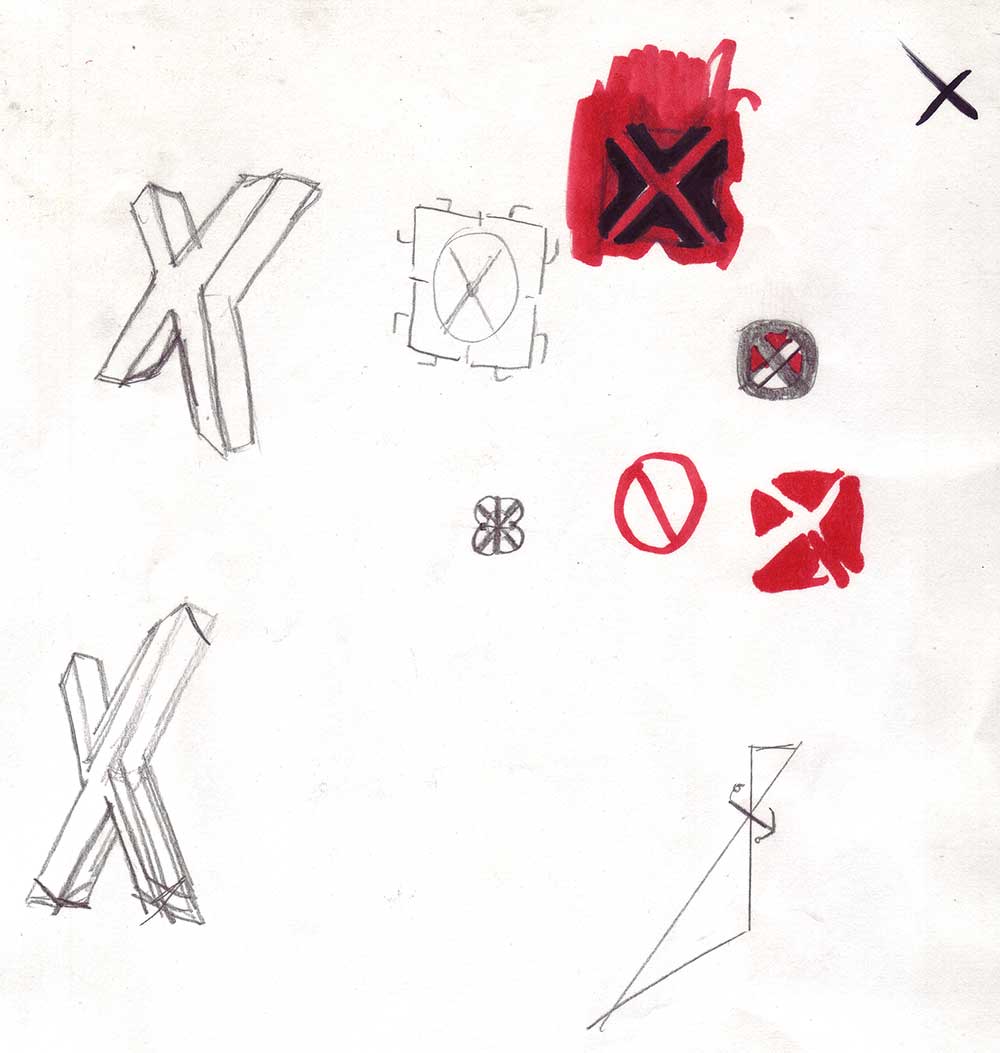
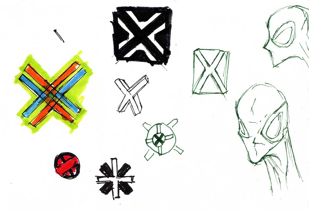
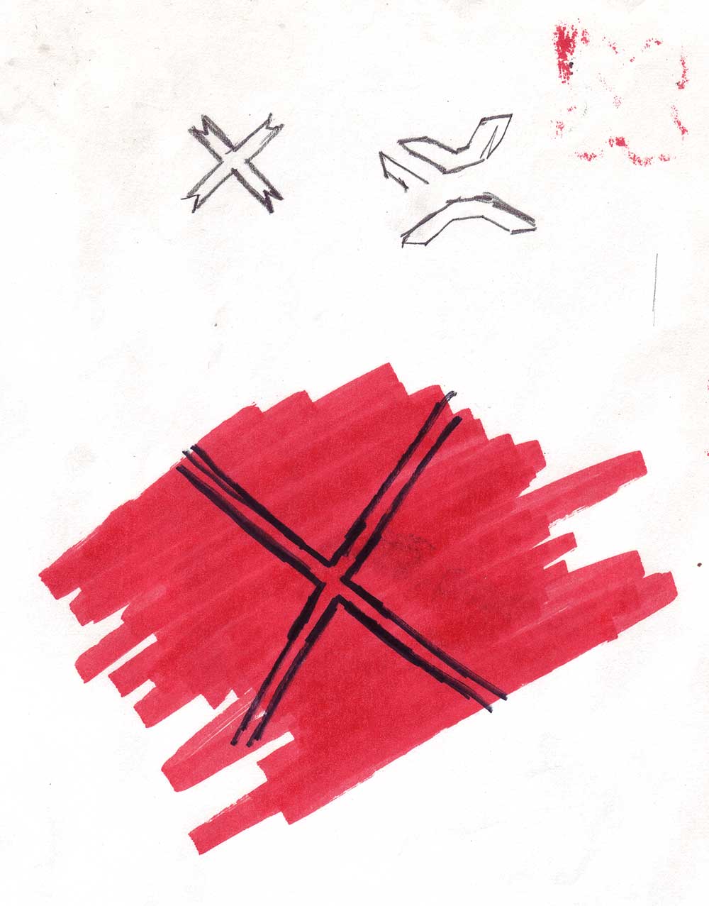
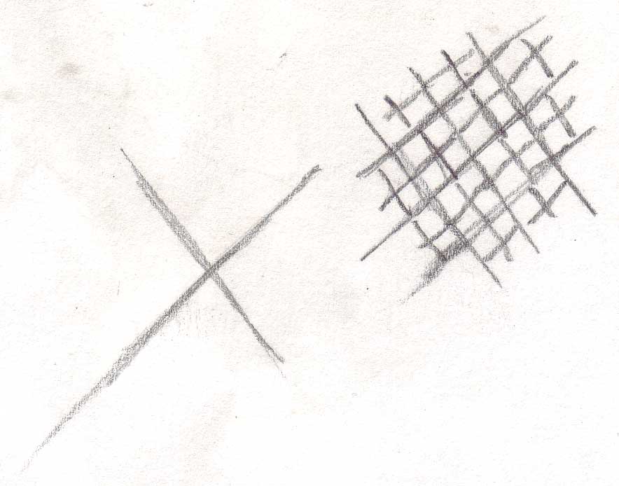
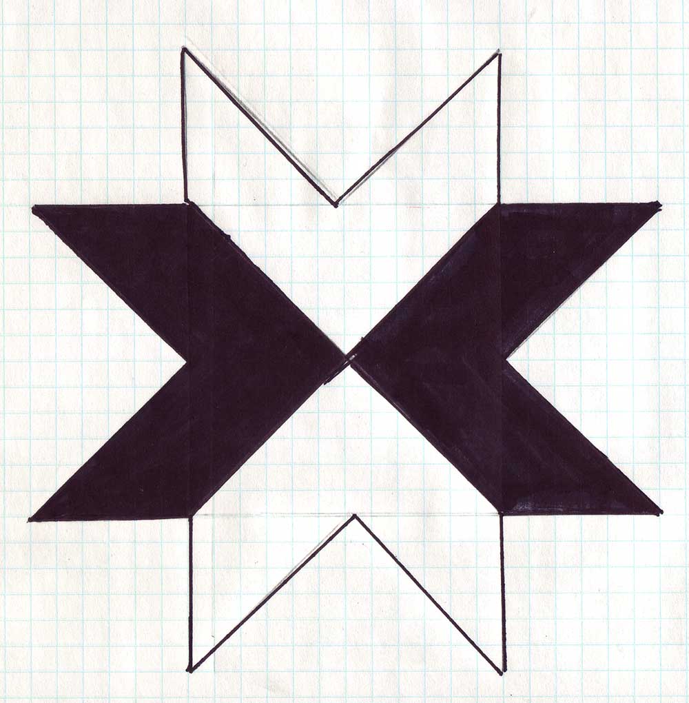
The Logo
My 13-year-old son Jordan Cloninger designed the logo. It went through several iterations based on a number of criteria. It needed to look good tiled horizontally and vertically because the goal of the hijack is to use Google Images as a kind of collage machine where the logos connects visually with each other across multiple images. Like all logos, it needed to be distinct, so that people would specifically associate it with the hijack. It needed to be robust enough to work at a number of sizes and resolutions. It needed to look kind of like a mystical sigil, like there was some sort of illuminati conspiracy going on that no one could quite figure out. It needed to cover enough of each image to be prominent itself, while still leaving enough of each image visible so that the image was recognizable by the Google Images recognition algorithms.
The final logo wound up having a couple of added effects. 1. It looks like a quilting pattern, which is appropriate since the goal of the Google Images hijack is to form a kind of collaborative networked quilt (and also because we live in the Appalachian Mountains where there are quilting bees and such). 2. It performs a kind of deconstructive erasure, placing the images under an X while leaving a trace of them visible. Since the goal of the hijack is to unbrand the word Xanadu and return it to itself, such erasure is appropriate.
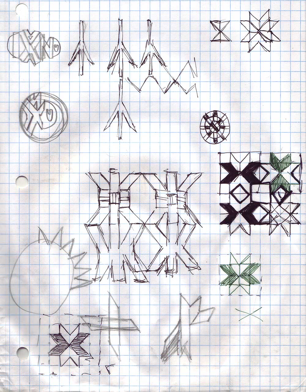
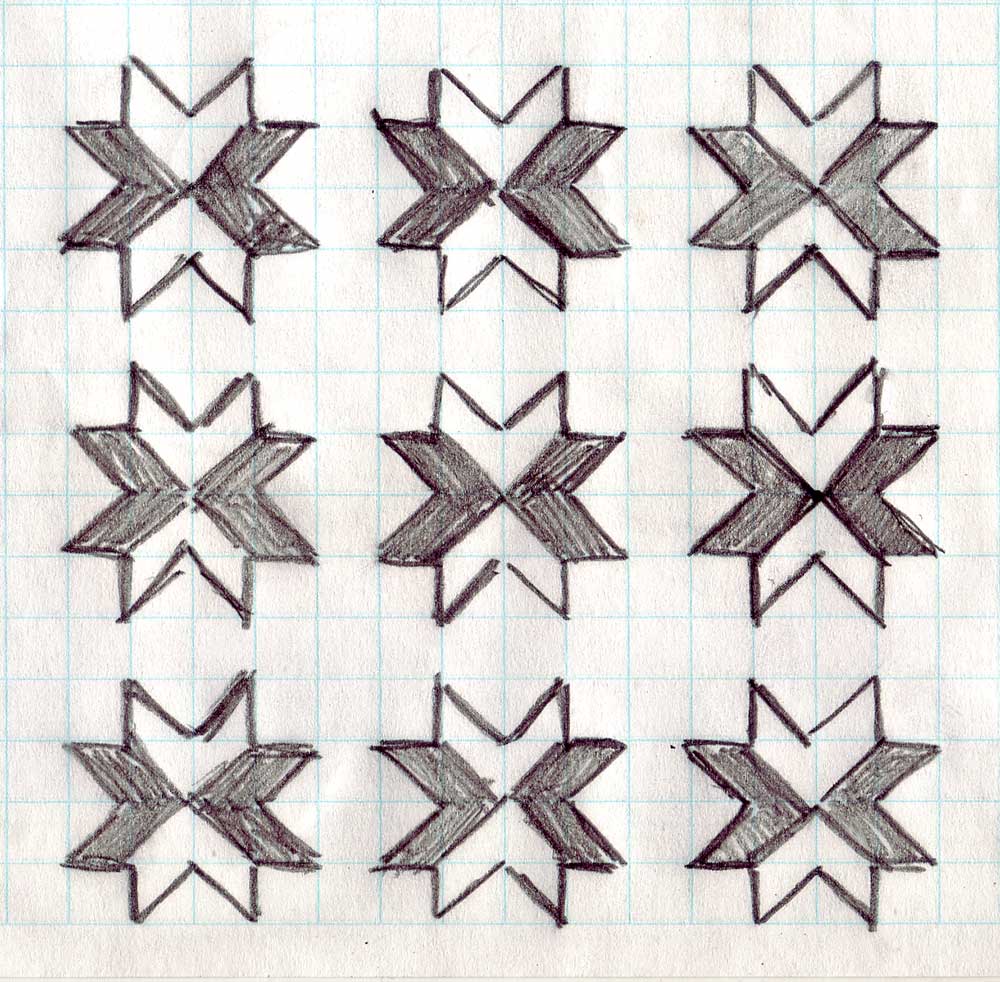
Here are Jordan's preliminary design sketches, in chronological order:
![]()